
Art
Alt Text for Illustrations and Comics: Describe the Story, Text and Visual Meaning
Before writing alt text for an illustration, ask what a reader would miss without the image. A raised hand might introduce a character on a portfolio page, complete a joke in a comic, or simply decorate a heading. The same drawing can need different text in each setting.
Useful alt text conveys the image’s purpose: a character, an action, words drawn into the scene, or a link’s destination. It need not catalogue every colour and brushstroke. The W3C’s guidance on informative images advises authors to convey the meaning presented visually and judge that meaning in context.
Decide what the image contributes
Read the heading, caption and surrounding paragraph before choosing an alternative. An informative illustration adds an event, relationship or idea that nearby text does not supply. Describe that contribution. Decorative artwork, or an image whose information is fully repeated beside it, can use an empty alt attribute: alt="". A functional image used as a link or button needs text that names its destination or action. A complex illustration may need a short alternative plus a longer description in the page.
The W3C alt decision tree asks whether an image contains words, performs an action, adds information, repeats nearby content or serves only as decoration. “Illustration” is a medium, not an automatic answer. A flourish can be decorative; a simple portrait can be informative.
Consider a fox drawn beside the heading “The Fox’s Workshop”. If the fox merely echoes the title, an empty alternative may be appropriate. If the drawing shows the fox repairing a torn map and the article discusses that repair, describe it. If selecting the fox opens a gallery, the image link needs an understandable destination. Reassess the drawing wherever it appears rather than reusing one saved description on every page.
Choose the character details that carry meaning
For a character illustration, begin with the established identity when it helps. Then select the pose, expression, object or relationship that gives the image its point. A costume detail earns space if it distinguishes the character or explains the scene. “A person in a coat” might be accurate but leave out why the work is shown.
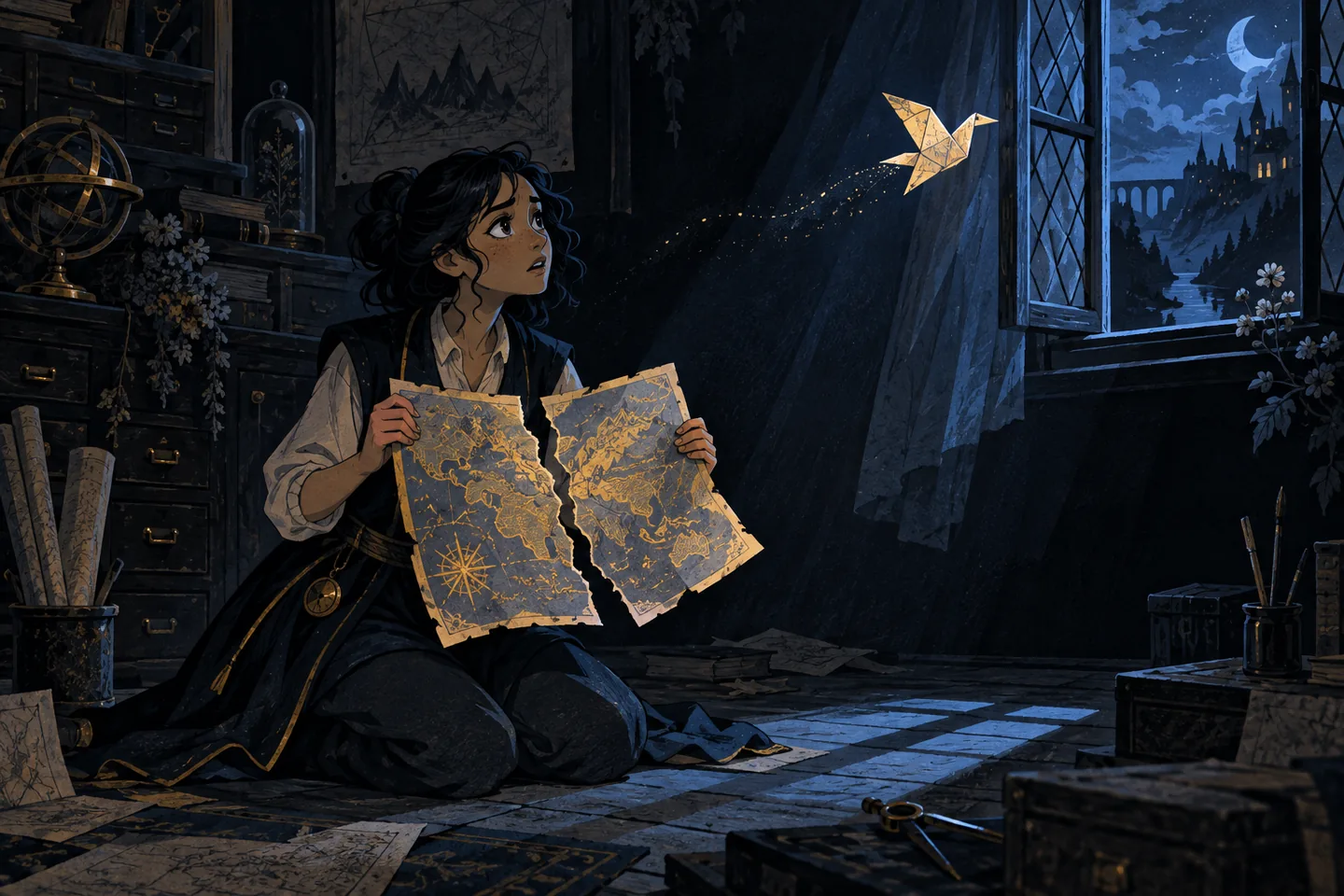
Imagine a page introducing Mina, a cartographer who repairs discarded maps. The drawing shows her holding two torn halves together while a paper bird escapes through an open window. The page already names her occupation, so the alternative can focus on the interrupted repair and the bird’s movement. Floorboards and window-frame colour add little to this scene.
Before and after: a character illustration
Before: “Beautiful colourful drawing of a girl with maps.”
After: “Mina holds a torn map together as a paper bird slips out of it and flies towards the open window.”
The revision replaces praise and a loose object list with the action that gives the picture meaning. It avoids claiming that Mina is frightened or delighted when the drawing does not establish either reaction. If adjacent text already describes the bird’s escape, shorten the alternative to the remaining visual detail or make it empty if nothing new remains.
Style may matter in an illustration portfolio. When the page invites readers to consider technique, a phrase such as “in sharply cut black and red shapes” can help. Put the scene first, then include only the visual treatment relevant to understanding or assessing the work. Do not infer a character’s identity or motive from appearance alone.
Give comic dialogue an order
In comics, meaning can sit between panels. Speech bubbles provide words, while a face or gesture may contradict them; a change in position can deliver the joke. Establish the intended panel order, assign each line to its speaker, and include the action needed to understand what follows. A transcript of speech alone may lose the visual turn.
Suppose a three-panel strip runs left to right. A child places a paper crown on a cat and asks, “Your Majesty, any requests?” The cat looks at an empty food bowl and says, “One.” The child brings a toy throne; the cat points back at the bowl. The joke depends on the child misunderstanding the request, so the bowl and final gesture belong in the description.
Before and after: a short comic
Before: “Three funny panels with a child and a cat. Your Majesty, any requests? One.”
After: “Three panels, read left to right. A child crowns a cat and asks, ‘Your Majesty, any requests?’ The cat looks at its empty bowl: ‘One.’ The child offers a toy throne; the cat points back at the bowl.”
The second version identifies the order, assigns the dialogue and includes the final action without explaining the joke again. Name an unusual reading path instead of assuming readers can infer it. For a longer sequence, use separate paragraphs or a numbered list in a visible description.
Words drawn into artwork need attention when they affect understanding: dialogue, signs, labels and notes can all change a scene. The W3C’s HTML alt technique says important words in an image should be included in its text alternative. Keep the wording and speaker where phrasing matters to a joke or conflict. Leave out incidental lettering that adds nothing to the page’s purpose.
Move a long sequence into page text
A dense comic page can have several speakers, a changed setting and a reveal across panels. Packing all of that into one alt attribute makes it difficult to follow. Use a short alternative to identify the artwork, then place a fuller account under a clear heading nearby. The W3C guidance on complex images describes a short alternative paired with a longer description when an image carries substantial information.
For example, a short alternative might say: “Four-panel comic about Mina’s missing map key. Panel description follows.” The visible description could read:
Panel 1: Mina searches a desk covered with maps. “The key was here,” she says. Panel 2: Her friend points to a small brass key drawn on a map. “This one?” Panel 3: Mina lifts the paper and a real key falls from behind it. Neither speaks. Panel 4: Mina holds up both keys: “I should label my labels.”
This account keeps the sequence and distinguishes the drawn key from the real one. It also preserves the silent pause. It does not list every object on the desk. If panel position matters, such as a threat visible behind one character but unseen by another, describe that relationship. Ensure the short alternative points to a description that actually exists, and write the longer text so it makes sense without seeing the artwork.
Make a final editing pass
Read the page with the illustration out of view. Check whether a reader can follow each event, speaker and reveal. Compare the alternative with the caption and nearby prose, cutting repeated information while retaining what the image alone contributes. Replace judgments such as “gorgeous” or “hilarious” with observable choices. Keep names and pronouns consistent with the page, and check every quoted line against its panel.
Finally, read the alternative aloud in the flow of the article. It should sound like part of the page rather than a file name, list of tags or art review. If it is too long for one comfortable sentence, consider whether the image calls for a visible description; if it says nothing the page has not already said, reconsider whether the alternative should be empty.